Car Accident Severity Study
For our project, we chose to work on a dataset of traffic accidents in the Continental US from 2016 to 2021
About
Car accidents are common occurrences that happen all the time. Even if someone has never been directly involved in an accident it is likely they have experienced waiting in traffic caused by an accident. Many different factors, both environmental and human, can affect the severity of these accidents. In this project, we aim to predict the severity of a car accident using environmental data. Being able to do this effectively could help inform emergency services on how best to respond to a given accident, or even how many units to preemptively schedule on different days. We have been using multiple machine learning models to attempt to accurately predict the severity of traffic accidents. The severity is measured on a scale from one to four based on several factors such as the length of the cleanup, or the length of the affected road. We chose to do this project because of personal experiences with car accidents and for the widespread potential benefits it could have.
Dataset and EDA
As our team scoured Kaggle for datasets we could use for a machine learning project, one on traffic accidents within the Continental United States caught our eyes. This dataset provided many details on the traffic accidents that occurred, containing over 40 columns of data and including factors such as visibility, the distance of road affected, and time of day. Using the discussion tab on Kaggle, we were able to gain better insight into what each of the columns meant, as well as become aware of any issues or misinformation within the data. To prepare for an exploratory data analysis, we first removed any columns that would be unhelpful in predicting the severity of an accident, as well as all null values. We also found it necessary to manipulate the data for visualization purposes, such as when we represented the start time of an accident by minutes after midnight, so that we could focus solely on the relation between time of day and accident severity.
Above is the correlation heat map we generated to show the relationships between different variables in our data set. From it, we can see that there is generally fairly low correlation between variables, which can make machine learning difficult. However, using this visualization we can easily see comparisons we may want to make through other visualizations.
To the left is a histogram produced to visualize the relationship between the time of day, represented by minutes after midnight, and the number of car accidents that occurred at that time. The first notable spike in the number of accidents can be seen around the 470 minute mark, or around 7:50 am, which coincides with the start of rush hour. A second and significantly higher spike in the number of accidents is noted at approximately 975 minutes after midnight or 4:15 pm. Once again, this increase could be attributed to rush hour, as a large number of cars being on the road at that time likely caused this spike in accident count. In addition, decreases in accident count occurred at around 4 a.m., while many are likely sleeping, and again at 9:45 am, when most commuters who drive to work have already arrived.
To the right is a histogram that measures the amount (count) of car accidents (y) to days after the Gregorian new year (x). We can see that there is a large dip on the 194-195 day mark (July 14-July 15) with a count of 125 accidents. As winter starts, the accidents increase and there is a peak on the 356-357 days with 3830 accidents occurring, likely due to weather conditions such as black ice. This makes sense as those days are Dec. 23-Dec. 24, Christmas Eve.
Our group decided to make a histogram showing the relationship between the severity level when affected by temperature. As the temperature increases, the level of severity increases as well. The highest accident severity level occurred at 72.5 to 73.4 degrees. More people tend to drive when the weather is pleasant. This diagram is accurate to the findings in our dataset because most car accidents occur at the highest severity level of 2.
The histogram to the right shows the severity count given the weather at the time. Looking at the graph you may see that the data is heavily skewed towards specific weather conditions. This imbalanced data may cause issues with using the data for machine learning. It should also be noted weather conditions are stored as string literals. Given these characteristics, it would be difficult to incorporate this column into machine learning; As a result, our team opted not to use this value to train our models. Nonetheless this data is useful to have for visualizations and should not be overlooked as it likely plays a role in the severity of car crashes.
Above and to the left is a choropleth map which we created shows the mean accident severity of car crashes by state. From this choropleth, we can clearly see that Wisconsin has the highest mean severity at about 3.5, and Arizona has the lowest mean average at just below 2. Arizona has a low population, so there could be fewer severe accidents due to fewer people on the road. A majority of the states have a mean accident severity of around 2 which was expected because of the high number of accident severity 2 in our dataset compared to the number of severities 1, 3, and 4. Above and to the right is the other choropleth we made to show the number of car crashes per state. In the choropleth, we can see that California and Florida have the highest number of car accidents at 54k for California and 55k for Florida. These high numbers are likely due to the high population density, especially in the many major cities found in California and Florida. The lowest number of car accidents is 14 found in Wyoming; this low number could be because of the low population of that state or a data collection error. There is no even distribution of the number of car accidents across the states which is probably caused by the different traffic laws and populations.
Machine Learning
KNN
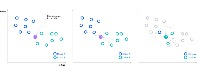
KNN stands for K Nearest Neighbors and is a supervised machine learning method that we used to predict the severity of car accidents. KNN classifies an input point by looking at a k number of points nearest to it and classifies the input point as the same class as the majority of points of the value K; for example, trying to classify something as a dog or cat with K=7, if the 7 nearest points consist of 4 dogs points around and 3 cat points then the model would classify the input as a dog. KNN works best when the data is highly clustered so it can make easy distinctions between the different classes and accurately classify the input. The model also workest best when the k is equal to a number that has a modulus of 1 to decrease the chances of tieing when trying to classify.
Support Vector Classifier (SVC)
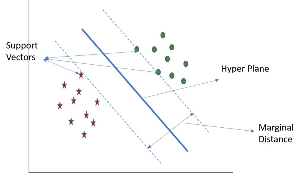
SVC, Support Vector Classifier, is a supervised machine learning model similar to KNN. SVC splits the data into different classes using boundaries to separate the labeled inputs. SVC classifies the inputs using the sections it created to split that data and classifies the input as which section it falls into. Like KNN, SVC models also work best when the data is highly clustered so it can make easy distinctions with its boundaries. SVC can easily fall short especially when the data points are near its dividing line because it becomes hard to make a distinction between the classes.
Random Forest
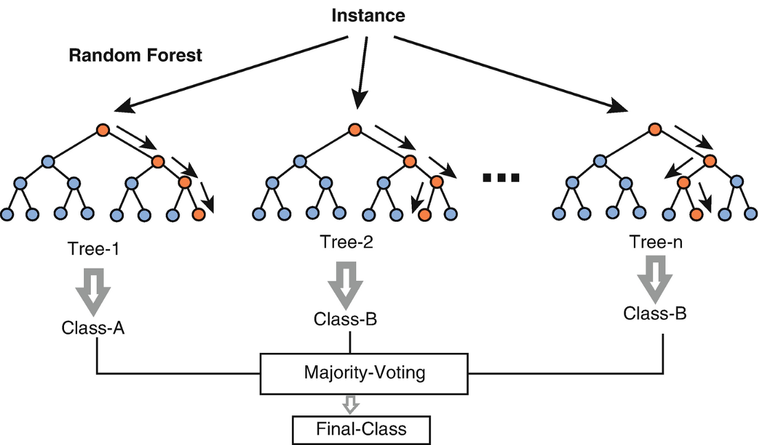
The Random Forest Classifier is a machine learning model that uses multiple decision trees to come to a predicted outcome. A decision tree will pass the input data through decision nodes to come to an outcome, which is then passed through another decision node. This process will repeat until the decision tree comes to an end. Each decision tree can “vote” for a predicted outcome and the winner of that “vote “is the output of the model. In essence, a Random Forest Classifier is an aggregation of many random decision trees to make the model stronger than having just one decision tree. Using function arguments such as n_estimators and max_depth, hyperparameters such as the number of trees in the forest and the depth of the decision trees can be set to improve model accuracy.
Neural Networks
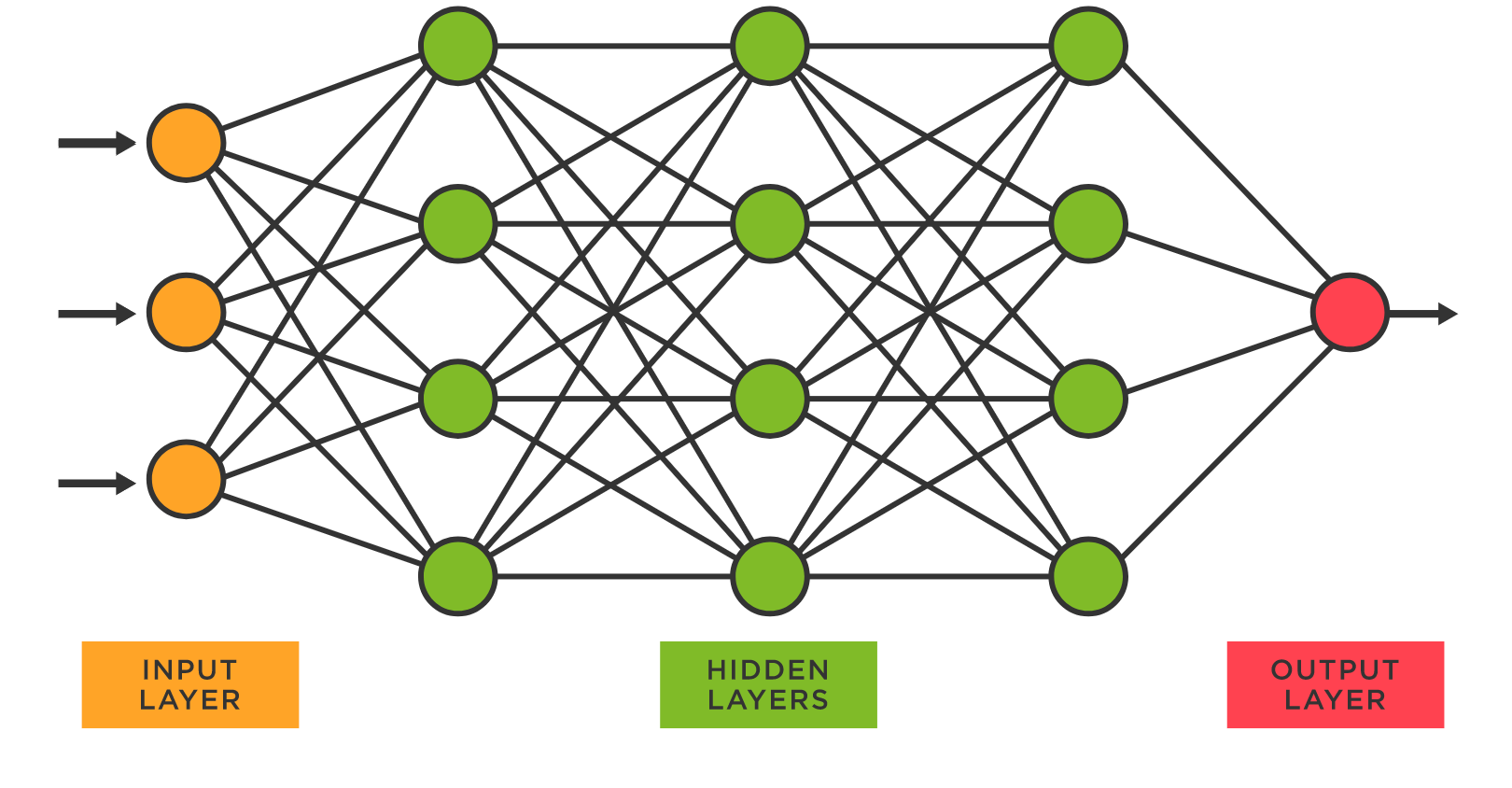
Neural networks are a machine learning method based on actual networks of neurons in the human brain. In its simplest form, there is an input layer and an output layer, but hidden layers can be added in between to allow for more complex modeling. The layers are comprised of nodes that are linked to each other through weighted connections to form a network. Neural networks need to train in order to have accurate predictions. Neural networks are trained using an optimization algorithm to find weights to best map inputs to outputs. This optimization algorithm is called backpropagation (or backward propagation), which is a method of using the output of a network to know how much of the loss (error) every node is responsible for, and subsequently updating the weights in such a way that minimizes the loss. This loss is found by comparing values generated through forward-propagation with the expected value. Forward propagation is simply the way to move from the input layer to the output layer in the neural network.
Below are the confusion matrices we used to visualize the results from our machine learning models. From the confusion matrices for KNN and SVC, we can see that SVC slightly outperformed KNN. Although both of these machine learning methods rely on clustered data, SVC was able to capture the patterns in our dataset more effectively. However, we can see that the SVC model tended to falsely identify many samples as having severity 2 when they were actually severity 3 or 4. The random forest classifier performed the best, achieving approximately 68% accuracy, which is reflected in its confusion matrix. Our neural network (multi-layer perceptron) classifier performed second best, although random forest was still the clear winner.
Conclusion
In conclusion, we were able to accurately predict the severity of a car accident based on a multitude of elements. We learned how to make machine learning models and visualizations to help test factors to the severity of traffic accidents. With the histograms, choropleths, and heatmap, we saw a lower correlation and measured the severity level to temperature, day, year, etc. Although we didn't have a lot of coding experience, we still managed to create a clear representation of our findings and provide information to help others realize the risks/consequences of traffic accidents.
Team
Meet the extraordinary Gravity Wells Team